
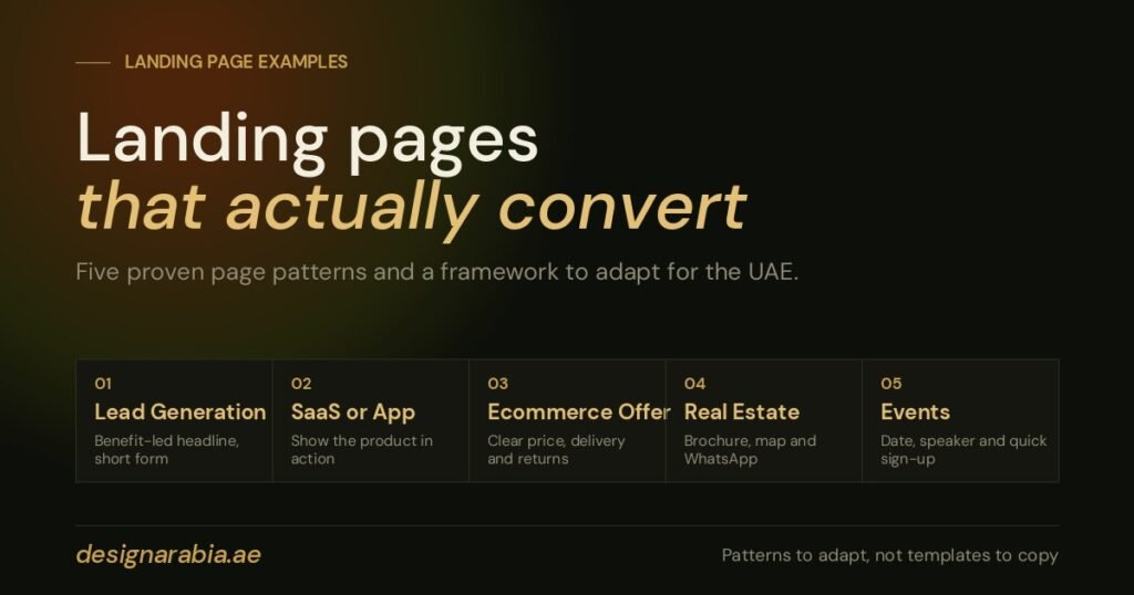
A high-converting landing page is not just a good-looking page. It is built around one audience, one offer and one next step. In the UAE that focus matters even more, because visitors compare options quickly, expect a smooth mobile experience, and may switch between English, Arabic, WhatsApp, phone calls and forms before they decide.
The best landing page examples share one pattern: they reduce uncertainty. They explain the value fast, show why the brand is credible, answer the visitor’s immediate doubts and make the next step feel easy. Whether you are promoting a property launch in Dubai, a B2B service in Abu Dhabi, a training course, an app or an online store, the principles are largely the same.
Below are five common landing page patterns, a simple framework for improving any page, and the mistakes that most often hold conversions back. If you are new to the topic, start with our guide on what a landing page is and why your business needs one.
What high-converting landing pages have in common
Clarity beats creativity. Design helps, but structure does the heavy lifting. Most effective pages include:
- A specific promise. The visitor understands what is on offer and why it matters straight away.
- A clear audience fit. The page feels made for their industry, need or stage of decision.
- One primary call to action. A page built for leads should not also push blog browsing and social follows.
- Proof near the action. Testimonials, client logos, results, ratings or certifications help people feel safe.
- Low-friction conversion. Short forms, click-to-call buttons, WhatsApp options and fast mobile layouts make a real difference.
- Message match. The headline and offer line up with the ad, email or search that brought the visitor.
For UAE audiences, local trust signals also help: regional client experience, UAE-based support, familiar payment options, Arabic availability where it is relevant, and quick replies on the channels people actually use.
Pattern 1: the lead generation service page
This is the most common pattern for agencies, consultants, clinics, education providers and B2B companies. The goal is an enquiry, a booked consultation or a call.
It starts with a headline about the benefit, such as “Get a custom digital marketing plan for your UAE business”, rather than a vague line like “Professional marketing services”. The subheading then says who the offer is for and what they receive. A practical structure looks like this:
- A hero section with a specific outcome and a call to action
- Three to five quick benefits
- A short explanation of how the service works
- Proof, such as testimonials, client types or results
- Answers to common doubts, like timelines and what happens after the form
- A short form with a reassuring button
Takeaway: build enough confidence before asking for personal details, not after.
Pattern 2: the SaaS or app demo page
Visitors want to know what the product does, whether it fits their use case and how hard it is to start. Show the product early with screenshots, short videos or workflow previews tied to real problems, not just abstract benefits.
A payroll tool for UAE businesses, for example, might highlight employee records, approval flows, reporting and document handling. Keep claims general unless they are verified and legally accurate, and never promise compliance or guaranteed outcomes you cannot back up.
Takeaway: turn features into everyday business outcomes.
Pattern 3: the ecommerce offer page
This one is built for speed. Shoppers want to know what the product is, why now, what it costs and whether delivery and returns are simple. Effective pages usually include:
- A strong product or lifestyle image
- A clear offer, such as a bundle, discount or free delivery threshold
- Benefit bullets above the fold
- Reviews or customer photos
- Shipping, returns and payment reassurance
- A sticky add-to-cart button on mobile
Delivery expectations can decide a sale in the UAE. If you deliver quickly across the main emirates, say so plainly, and make payment options, cash on delivery rules and support hours clear. Our posts on ecommerce web design trends and ecommerce solutions in Dubai go deeper.
Takeaway: remove purchase anxiety and make buying feel immediate.
Pattern 4: the real estate landing page
Property campaigns in Dubai and Abu Dhabi are highly competitive, and a buyer may compare several developers, communities and payment plans within minutes. Lead with the decision factor that matters most, whether that is location, starting price, payment plan, handover date or investment angle, and avoid cramming every detail into the first screen.
- A hero image or video of the property or community
- Clear project positioning
- Unit types, amenities and location highlights
- A downloadable brochure
- A map for location context
- An enquiry form with phone and WhatsApp options
- Credibility signals for the broker, developer or agency
Because these are high-value decisions, offer several ways to get in touch. Some people will fill in a form, others will prefer WhatsApp or a call. See our guide to digital marketing for real estate agents for the wider campaign picture.
Takeaway: balance aspiration with the practical details buyers need.
Pattern 5: the webinar, event or training page
Relevance and urgency matter here. Visitors need to know what they will learn, who is leading it and why it is worth their time. Include the topic, date, time, format, speaker credentials, who should attend and a simple registration form, plus a deadline or limited-seats note only if it is true.
For UAE audiences, state the time zone and whether the event is online, in person or hybrid. If it is in person, make the emirate and venue easy to scan.
Takeaway: the value of attending should feel bigger than the effort of registering.
A simple five-part framework for landing page strategy
1. Match the intent
Ask what the visitor was trying to do before they arrived. Someone searching “book a business setup consultation” is closer to buying than someone searching “how to start a company in Dubai”, who may need education before a call to action.
2. Lead with the outcome
Your headline should answer the silent question, “Why should I stay?” Specific beats clever, and clear beats broad.
3. Build trust before the ask
Place proof close to the button: testimonials, client categories, years of experience, certifications, case studies, guarantees or transparent process steps. Only use claims you can support.
4. Reduce friction
Every extra field, unclear button, slow image or distracting menu link costs conversions. Keep the page focused and easy to complete on a phone.
5. Test one meaningful change at a time
Try different headline angles, button wording, form length, hero visuals and proof placement. Change one thing at once, or you will not know what made the difference.
Common mistakes that stop landing pages converting
- Generic headlines. “Your trusted partner” does not explain the offer.
- Too many calls to action. Competing buttons dilute attention.
- A weak mobile experience. Mobile traffic is significant in most UAE campaigns, so forms and buttons must work on small screens.
- No local relevance. If you serve the UAE, say so where it matters.
- Hidden pricing or next steps. If you cannot show prices, explain how quotes or consultations work.
- Long forms too early. Ask only for what you need at the first step.
- Unclear proof. Testimonials without names, roles or context feel less credible.
Practical takeaways for UAE marketers
Start with the campaign goal and work backwards. A page for Google Ads should closely match the keyword and the ad copy, which is something we build in from the start in our Google Ads management. A page for LinkedIn should speak to a role, industry or business problem. A page for Instagram or TikTok traffic may need stronger visuals and faster proof.
Before you publish, ask:
- Can a visitor understand the offer in five seconds?
- Is the call to action visible without feeling pushy?
- Does the page explain why your brand is credible?
- Is it relevant to UAE buyers or decision-makers?
- Does it work smoothly on mobile?
- Are WhatsApp, phone and form options used sensibly?
- Are the claims realistic, specific and supportable?
Final thoughts
The most useful landing page examples are patterns to adapt, not templates to copy. When you understand the visitor’s intent, remove friction and give a clear reason to act, a landing page becomes a focused way to turn campaign traffic into enquiries and sales. If you would like help planning or building one, see our landing page design service or request a free quote.